Using a Mac – the rights and wrongs
It has been a year since my “conversion”. That word makes it sounds like a religious experience. In some ways, moving to a Mac felt just like that. Although I am quite happy using the machines, I still feel like a beginner with lots to learn. However, a number of friends, who know that I have lot of computer experience, just assume that I am an expert. My definition of an “expert” is someone who is a page ahead of you in the manual.
Of course, I am not 100% certain that I do everything correctly or in the most efficient way. This was compounded recently, when I was working with an experienced Mac user, who saw me do something [start Lightroom, I think], and said “What did you just do?” …
Sophisticated user interfaces to operating systems or application programs tend to offer numerous ways to get things done and the choice of which way you choose to do something is a matter of personal preference. The two areas of Mac usage where I see multiple options are: starting apps and managing running apps.
Starting apps
![]() I can think of about seven different ways to start an app in MacOS [as we must begin to think of it]. Rejecting two of them as silly [direct access to Applications folder and the command line], that leaves five that are commonly used:
I can think of about seven different ways to start an app in MacOS [as we must begin to think of it]. Rejecting two of them as silly [direct access to Applications folder and the command line], that leaves five that are commonly used:
Locking apps into the Dock. This is a very common approach, because it almost happens by itself. The downside is that, if you have a fair number of apps installed, the Dock can look very messy very quickly. It is also very hard to see what is actually running – the little dots are hard to spot. Way back, before I got a Mac, I was trying to help someone who was using one. I asked her “What is actually running?” She had no idea. Maybe she was right to not care? I lock almost nothing into the Dock, so it just shows the running apps, Downloads folder and Trash.
Desktop icons. It is very common for Windows users to litter their desktops with icons, which may be files, folders or shortcuts to files or apps. Some Mac users do the same. I find this approach very confusing – I can never find anything. I treat my computer’s desktop just like I do my “real” desk. It only contains files or “stuff” that I am using right now or very soon. No clutter.
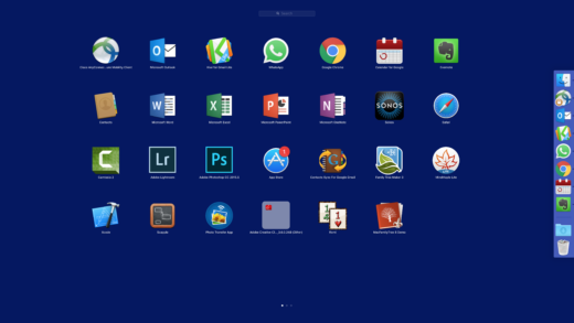
Launchpad. I am not sure how long the Launchpad app has been around, but it does seem well integrated into the OS. It can be invoked in various ways – I tend to use the 4-finger pinch. I have rearranged the apps so that my frequently used ones are all on the first page. To an iPad/iPhone user, Launchpad feels very natural. This is my most common method to start apps.
Spotlight Search. Although it has a ton of other uses, Spotlight Search is a quick way to start an app. Just key CMD-SPACE and then type 2-3 letters from the apps name and you are there. I find myself using this method more and more.
Data driven app launch. Many users have a workflow that rarely involves creating new documents. They just open existing files or make a copy from a template. Double-clicking on the file opens the associated app, so there is no need to launch it explicitly. Of course, I use this technique quite frequently
There are probably numerous launcher apps available, but, as yet, I have not felt the need to investigate.
Managing running apps
Most users will have multiple apps running simultaneously. At a glance [at the Dock], I see that I have 7 along with Finder; I rarely have more than about 10. I always found that Windows did not behave well with too many apps running. When my daughter and I went into a store to get her MacBook [the first Mac in the family], I asked the sales guy about this matter. He promptly opened about 30 apps on a Mac and showed me the almost instantaneous swapping between them. That dislodged my credit card from my wallet.
Most users seem to simply open lots of windows on top of one another, iconizing when necessary. This seems to involve quite a lot of fiddling to get from one app to another. I make heavy use of Spaces – multiple desktops – which seem to work like a charm. On the MacBook I typically have one space per app, using the 3-finger swipe or CTRL-number to get between them. On the iMac, I may have 2-3 apps in a space, with their windows tiled, not overlapping [with the help of the Magnet app].
There are no rights and wrongs on these matters. I am open to suggestions and advice by comment, email or via social media.

