Success can be elusive
This week I attended the assessment of my work with which I was endeavoring to get an ARPS [Associate of the Royal Photographic Society] award. It was my third attempt – I was hoping for third time lucky. I started this process 5 years ago and wrote about my first attempt here. This time I worked very hard to get everything right. I took advice from a very good source. Got some input from fellow photographers. I made sure that I dotted all the Is and crossed all the Ts. But I went along to the RPS, knowing that I would see some other submissions that would blow me away, others that would leave me cold and would have no certainty of success myself …
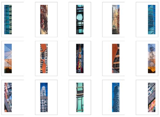
To apply for an ARPS, you are required to submit a panel of 15 pictures, which must be arranged in a suitable way. Here is mine:
Also, there must be a “statement of intent” that describes what the set of pictures is all about. Here is what I wrote:
I enjoy the use of indirect imaging – silhouettes, shadows and reflections – particularly to depict a mood or an atmosphere. Reflections are the most expressive. The ubiquitous utilization of glass in modern cities means that reflections are many and varied. I have applied them to illustrate the vibrance and vitality – verging on chaos – of the urban environment, using a series of individual images with a common aspect ratio that depicts a sense of scale, and a presentation that complements the reflections.
The assessment process is quite straightforward. The pictures are displayed at the front of the room. The panel of [4] assessors look at them – from a distance and close-up. A couple of the assessors then pass comments – some kind of feedback. Then they vote [this is not visible to the audience]. And the chairman announces the result. This will either be that they will be recommending the submission for acceptance [and the submitter is identified and congratulated] or that they are not making a recommendation. In the latter case, the submitter’s anonymity is maintained and the feedback is written up to send to them later. My name was not announced.
The initial comments were that I had quite an original idea and approach and the presentation of tall, thin images was novel and made sense. Then there were some specific comments:
- The middle images on the top and bottom rows were too similar in color. To my mind, they are not that similar, but they are consistent in tone.
- The top right image is not vertical. This is true, but I would contend that buildings – particularly reflections of buildings – do not actually appear vertical when you look up at them unless you hold your head perfectly straight, which normal human beings do not do.
- The quality of the images was inconsistent, giving the impression that they were just pulled from a library to complete the set. Although this is true, I would contend that the “quality” of reflections is incredibly variable by their very nature.
- The focus of the images was mostly on the reflecting surface, not the subject being reflected. I suggest that the person saying this should actually go and use their eyes and look at some reflections.
- The choice of glossy paper means that they attract dust. Please excuse my Anglo Saxon, but FFS! If I had used matt paper, they would have carefully explained that, for reflections, I needed high gloss.
- The set was more style than substance. I will refrain from comment.
I could fix (1) and (2), but the rest seem not to be fixable [to me].
Having seen a number of assessments, I always have the impression that the panel decide whether they like a submission or not in a purely subjective way. If they decide to reject it, they then come up with some justifications. They would, of course, deny this.
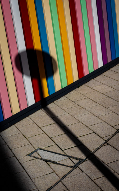
As I left the place and went to find some lunch, I had two questions in my mind. First, am I going to have another shot at it? I will have to think about that one. Second, what do I do now? That was easier: take some photos. I had my camera and I can find pictures anywhere. Here are a couple:
It seems that I can still do it …


