Simcenter STAR-CCM+ v13.04: Lies, Damned Lies and Statistical Reports?

When you share numbers of merit or a plot with a colleague, the ensuing discussion moves promptly forward. But what if you mention that you used statistics to generate the information? Instant suspicion. Lots of questions before you even start talking about the results. And questions should get asked, details matter! Statistics then, much maligned for many years. “Facts are stubborn things, but statistics are pliable.” (Mark Twain, Author). So why the enduring distrust? We’ve been using statistics for a long time for a lot of good reasons. They help us to see the bigger picture. And with our increasingly complex analyses, we’ve got a strong need to reduce that complexity, so that people with differing backgrounds can arrive at decisions quicker, more easily, and with more confidence (and hopefully less skepticism). With Simcenter STAR-CCM+ v13.04 we’ve got two enhancements, which answer the intent of 11 of your IdeaStorm requests, to make the quantitative presentation and statistical treatment of your data easier.
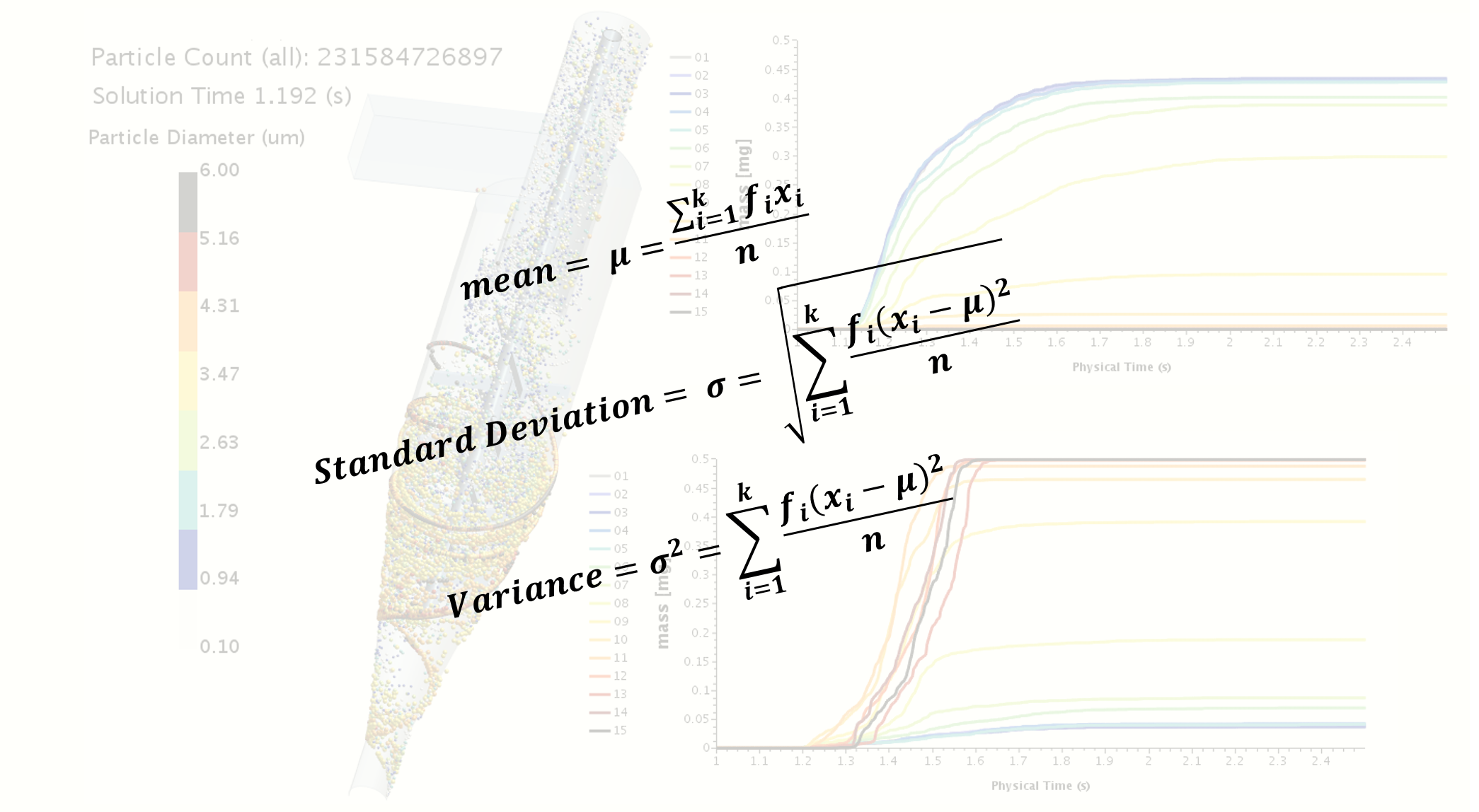
The first enhancement is a single check box for any plot type (XY, Monitor, Histogram) that lets you accumulate your Y-values. In the animation below, we see a very notional upper airway bifurcation. Two size distributions, with mean diameters of ~5 microns and ~10 microns respectively, are used to model the fate of a bolus of inhaled particles over four respiratory flow cycles. Before this release, you could plot the instantaneous mass of that bolus leaving either outlet A or B. This is what you see in the bottom right plot. What’s new is the top right plot which shows the mass, accumulated over time. The only setup difference between the two? A check box setting for each of the four data series. Your workflow then to create the accumulative plot reduces to this: make the plot at the bottom right first; make a copy of that plot; in the copy, toggle the Accumulate check box on all four data series (which further reduces to a single action if you multi-select all four and change the property); and, done.
I can hear you saying, “Hold on, accumulative plotting isn’t statistics – is the paraphrased and variously attributed [1] title of your blog as misleading as the extent of distrust when it comes to interpreting statistical data?” Saving the best for last, we are pleased to introduce Statistical Reports. In the next animation, what you see at far left is a small mixing device. This simulation effort is inspired by work published by Ammar et. al. [2].
The mixer is in the shape of an arrow, with two inlets, left and right (right side view is clipped), feeding into the main mixing channel which contains an SMX-style static mixer. To the right of the axial view, several cross-sectional views show the local variation of Phase A. Flow thru the inlets is varied in an alternating, sinusoidally pulsed way. To assess the extent of mixing, we’re making use of a metric called the mixing intensity [2], and in general, the higher this term is, the better. The cross section we’re most interested is downstream from the mixing element, section F. The faint red line in the time history plot at right shows the instantaneous mixing intensity. Using our new Statistical Reports, we can now calculate the Mean of the mixing intensity on this surface. We can make this quantitative analysis more sophisticated by adding a trigger to reset data collection. So, every time the inlet sinusoidal pulse goes thru a full cycle (dashed line intersecting the dotted line), the Mean Statistical Report data source gets reset. The heavy black line shows the cycle to cycle Mean mixing intensity. The red and yellow lines, also new Statistical Reports, provide upper and lower bounds for the Maximum and Minimum mixing intensity. Now we can really explore the question: Is this mixer any good? Ammar et. al.[2] provide compelling evidence to suggest that “time-dependent flow-rate combined with geometric effects can enhance mixing”. What we see here is an opportunity for design exploration – What if we change the amplitude and/or period of the sinusoidally pulsed inlet flows? What is the best angle for the arrow inlets? Do we add more bars to the static mixer element – we used 3 for this case, what about 6? Or 9? Do we add more mixing elements? We used only 2 in this example. What conclusions would you draw from this “treated” presentation of the results? Permutations are broad indeed, and now you have new tools within Simcenter STAR-CCM+ v13.04 to generate the metrics you need to make informed, effective assessments.
With great power comes great responsibility (again variously attributed). We plan to build on this introductory feature set with support for Variance and Covariance in upcoming releases, and if you have something else in mind please let us know. In the meantime, let me close with this thought: “You are entitled to your opinion. But you are not entitled to your own facts” (Daniel Patrick Moynihan, New York Senator). With well considered, well prepared facts, efficiently generated, you’ll be able to make the best decisions.
- The University of York, Department of Mathematics, “Lies, Damned Lies and Statistics” (2012) Retrieved from https://www.york.ac.uk/depts/maths/histstat/lies.htm
- Ammar, H., et. al., “Flow Pulsation and Geometry Effects on Mixing of Two Miscible Fluids in Microchannels”, (2014) J. Fluids Engineering, 136, pp 121101-1 – 121101-9, (2014)