ST6: How do You Use the New Interface Customizations?

Sixteen years ago when I changed from AutoCAD/Mechanical Desktop to SolidWorks, my main advice for other people making the same change was to simply forget everything they thought they knew about CAD, and just start again. A clean slate of assumptions is hard to do, and often trying to compare a new way of doing things to the old way of doing things is just counter-productive.
This newest switch for me, from Works to Edge is somewhat different because the packages are similar in some ways, and yet in other ways they are very different. The big thing to understand in Solid Edge is the workflow, and the Command Bar and Prompt Bar both help you through that. After the workflow, the interface is the next thing to master. The newest version of Solid Edge, ST6, has a lot of interface enhancements aimed at helping 3D CAD users making the switch.
In ST6, the big new thing for the interface is called Themes. One of the goals of Themes is to rearrange parts of the Solid Edge interface to help people migrating from other software. Before I was hired, I worked with the development people on what a Solid Works user would find confusing in the Solid Edge standard interface.

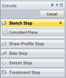
The first thing that I mentioned in these discussions with development was that the Command Bar, while brilliant especially for expert users, can be tough to navigate for a migrating user. Works users are used to an interface that is pretty verbose (lots of words), and the Edge interface is very sparse (very few words). The great thing about the options with Edge is that you can rearrange the Command Bar to be vertical, with words (like the Works PropertyManager) or horizontal with just icons and tooltips.


Tooltip flyouts are very helpful, but they take time, and you can’t see multiple ones at once. The options Edge offers for this part of the interface are very useful.
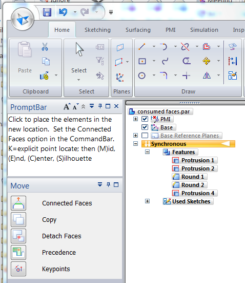
Another thing that came up during my visits with development was that the PromptBar in Solid Edge is another really nice tool for someone making a transition. What I like most about the PromptBar is that it helps you with the next step in the feature workflow. The thing I didn’t like about it was that sometimes I would forget to use it. One of the Theme options puts the PromptBar in the upper left of the window, right where you can’t miss it. This is my favorite way of using the software. I’ve got the PromptBar in the upper left, with the CommandBar right below it, then the Pathfinder just to the right.

This is really the Some Assistance theme with a little tweak to the CommandBar. The Edge Bar (with the Feature Library, YouTube, Help, Family Of Parts and so on) goes on the right side of the graphics window, kind of like the Task Pane in Works.
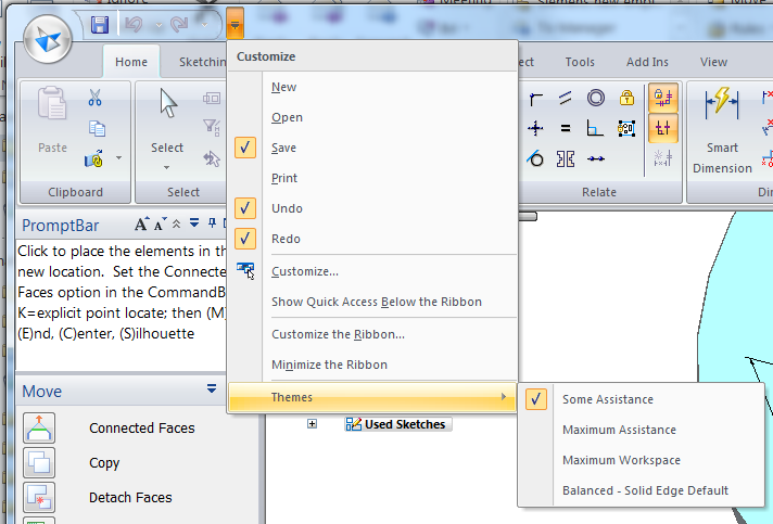
You can access all the themes from the dropdown arrow to the right of the Quick Access toolbar (upper left, next to the Solid Edge application icon).
The Solid Edge ST6 Themes are called Some Assistance, Maximum Assistance, Maximum Workspace, and Balanced – Solid Edge Default. If you want to learn more about the advantages of the various themes, follow this link. (Another article is going to make the case for Web Help, but here’s a preview of one of the benefits – I can link to the Solid Edge Web Help directly from any web-based article).
 The first thing I like about the new theme layout is that Solid Edge seems to acknowledge in the names that interface layout is competition between conflicting goals: access to tools (speed/mouseclicks) and workspace. It lets you make your own decision. Not everyone has the same needs, so nice pre-packaged options are really a great thing for new users who are investigating. Of course the interface is fully customizable as well, once you learn your way around. Themes are just a great way to get started.
For new users, I suggest you play with the Theme settings, to see what suits you best. Again, my favorite is the Some Assistance. I truly envy Solid Edge expert users who can use the stripped-down CommandBar, which is the most efficient use of interface space I have ever seen.
For experienced users, I’m interested in knowing how you set up your interface? Do you customize the QuickBar? What do you find most efficient way to use Solid Edge?


