QAT versus the Radial Menu

Prolog
Without a doubt the Quick Access Toolbar or simply QAT is the best place to run frequently used Solid Edge commands and macros. But the real estate on the QAT is limited unless you have a wide screen monitor with a graphics card that supports high-resolutions in which case you can keep more of the goodies within eyeshot from the mouse cursor.
To contradict my opening line the QAT however is only the next best way after the Radial menu to issue commands. Whereas the radial menu provides commands right at the mouse cursor, it needs to be brought to the fore by press dragging the right mouse button, the QAT is available all the time in plain sight.
![]() A previous blog article discuss the radial menu and its customization.
A previous blog article discuss the radial menu and its customization.
Another advantage of QAT is it can easily overcome the limit of 16 commands faced with the radial menu but the radial menu layout appears more organized in concentric circles whereas the QAT is a plain list of commands in one direction. You need to aim and click a command on the QAT.
Customizing the QAT
So much for the pros and cons of each, let’s turn attention to all the fun we can have using the QAT and how to customize it to manipulate the existing set of commands.
By default the QAT sports a basic set of frequently used commands and you can choose which ones to display or hide by clicking a unique icon called the customize arrow at the end of existing ones which then opens up a short menu of checkable items.
This downward pointing tiny triangle is your gateway to customize not just the QAT but an entire gamut of user interface elements of Sold Edge which includes the radial menu, the ribbon bar, pathfinder, keyboard shortcuts along with settings for the CommandBar, Design Intent panel, Tooltips and a host of other UI behaviors.
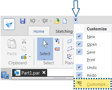
One of the most appealing options further down in the menu, not shown in the image above is to place the QAT below the ribbon which results in the QAT being placed closer to and thereby resulting in faster access from the center of action which is the drawing or modeling area. To some this might also appear to be eating up precious modeling/drawing space since it consumes another stripe below ribbon.
Any Solid Edge command from its respective environment can be added to the QAT. That’s right – the QAT can be customized for each environment separately. An environment is not confined to a file type like the part, draft or assembly but also sub-environments like detail view, sketcher, ERA, Express Route, Block Edit to name a few.
![]() There are a mind-boggling 28 environments in Solid Edge if you didn’t know already.
There are a mind-boggling 28 environments in Solid Edge if you didn’t know already.
What’s more, you can also have commands to appear on the QAT when no documents are open in Solid Edge.
The foremost command that I’d love to add is the Recent Documents list. Having the pin icon which allows real quick access to the recently opened files has a soothing effect, especially for ST9 users who had a nightmarish experience with the Application button.
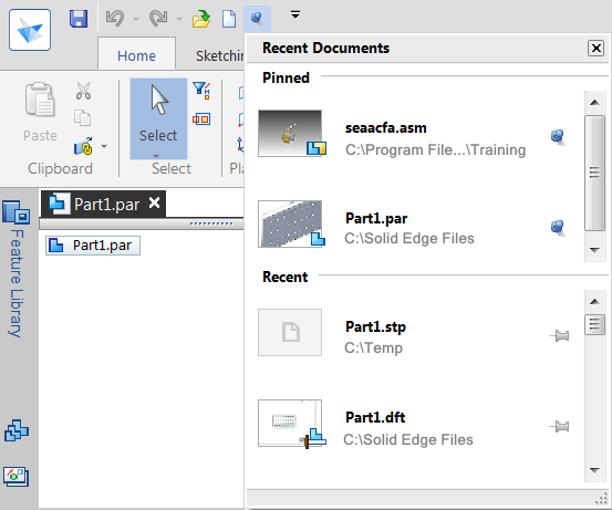
As a bonus, the pinned and recent documents can not only be scrolled separately but the list also has a resize handle in the bottom right corner.
To add a Solid Edge command, select Customize… from the menu as shown in the first image of this article. This opens up the Customize dialog which shows a typical set of From-To lists with buttons placed in the space between the two for adding/removing.
The list on the right is meant for the commands on the QAT while the left side list can be told to display commands from various regions of Solid Edge.
The pull down list labeled ‘Choose commands from:’ can be used for this:
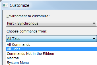
- The ‘All Tabs’ option will display commands in a tree view fashion like folders in Windows Explorer where each node corresponds to a ribbon tab and you can explore further down as if choosing commands from the ribbon tabs which you are familiar.
- The ‘All Commands’ options will display as it implies all commands of Solid Edge alphabetically.
- The ‘System Menu’ option will show all commands under the Solid Edge Application button
- Selecting macros will uncover a browse button which will let you pick your favorite Solid Edge apps. This article gives a complete recipe for adding custom apps to the Solid Edge UI. There are differences between ST8 and later releases which are covered with more details in there.
Once you have found the command to add to the QAT in the left side list, select the command and click the Add >> button to add the selected command to the list on the right side. It’s as simple as that !
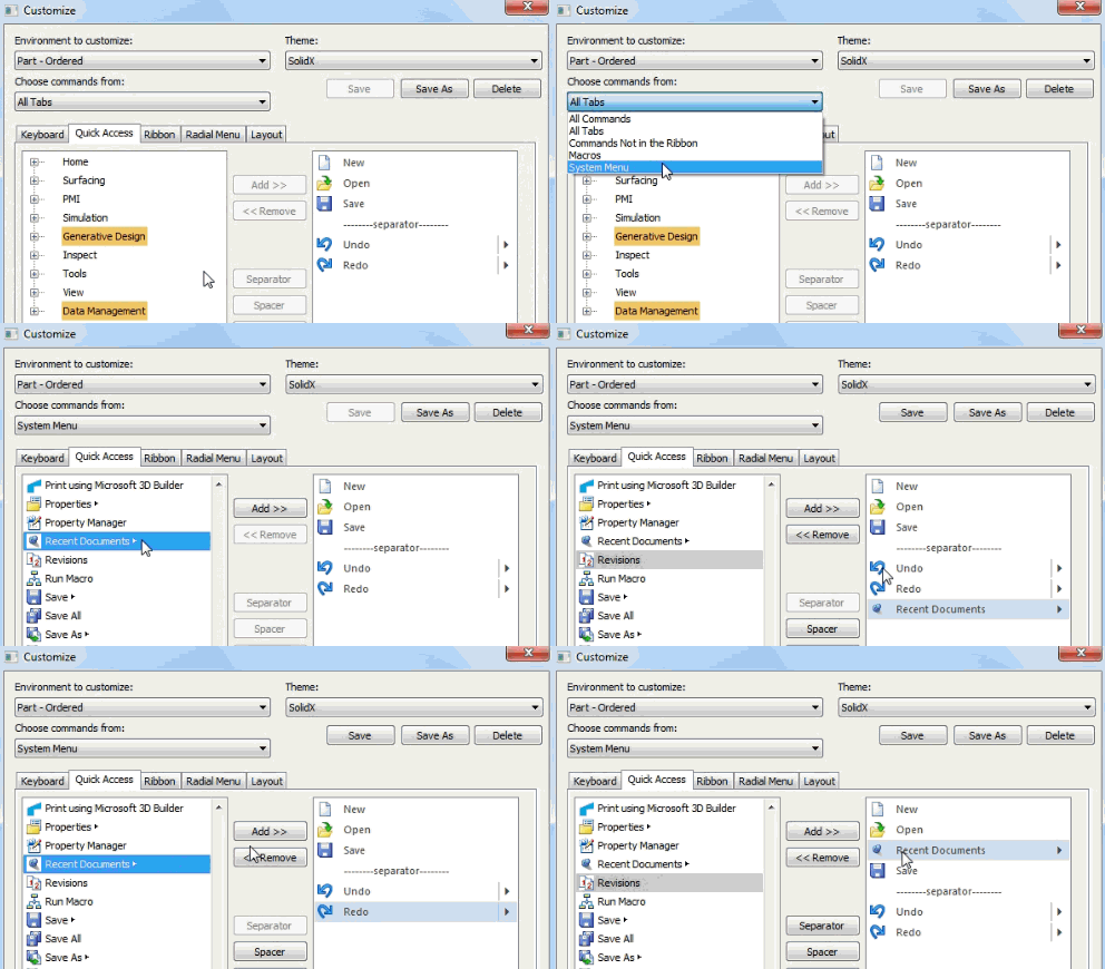
The animation below demonstrates how to remove the default New command which opens the New dialog with a drop-list New command which allows direct picking of a document template.
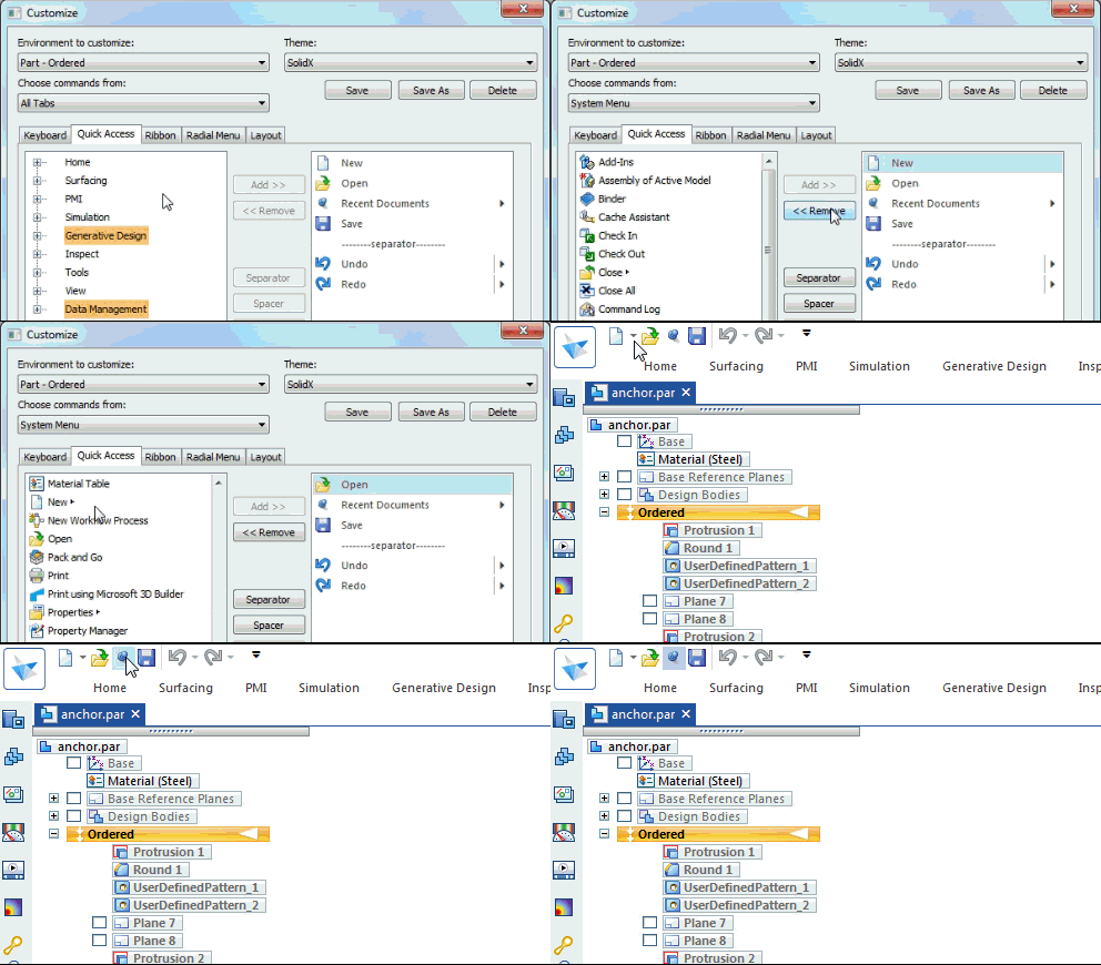
![]() A hidden gem about customizing the QAT is right clicking any command on the ribbon and asking it to be added to the QAT. The command then would appear on the QAT in a jiffy. It is pleasurable like loading up your shopping cart from the Solid Edge features superstore and start consuming them without having to checkout.
A hidden gem about customizing the QAT is right clicking any command on the ribbon and asking it to be added to the QAT. The command then would appear on the QAT in a jiffy. It is pleasurable like loading up your shopping cart from the Solid Edge features superstore and start consuming them without having to checkout.
Similarly it is also possible to right-click on any icon on the QAT and opt to remove it without resorting to the Customize dialog. But reordering of the icons on the QAT is not possible on-the-fly, so this topic deserves some attention.
Reordering the QAT buttons. You have two options:
- Default Position – Clicking the Add button places the selected command to the end of the QAT list on the right side. The Move Up or Move Down buttons can be used after this to place the command at a desired rank.
- Preselected Position – Select an existing command in the QAT list on the right-side. Then click the Add>> button. This will directly add the command icon below the selected one in the QAT list saving you the hassle of moving it up all the way to the desired position.
The following animation illustrates the preselection:
Epilog
The title of the article was only an attention grabber. The QAT and the radial menu complement each other in reality and are just few of the numerous ways in which a command can be issued in Solid Edge, though as a user I wish Solid Edge had a list of last used commands in the context menu which could also be customized like other UI elements.
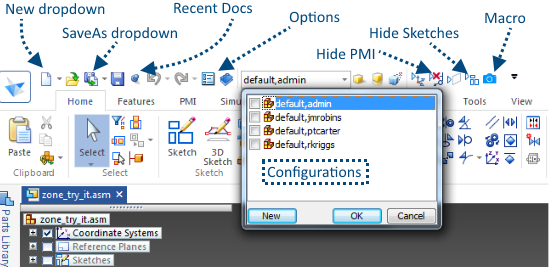
Do not hesitate. Show off images of your gleaming QATs in the comments below adding little notes how they have helped and how you have tweaked them over the years for optimal use of the space available on the title bar. Here’s mine to get you started:


Comments