Manufacturing Planning and the User Experience

Why does the user interface matter so much in digital manufacturing, and what makes a great user experience? Read on to learn how manufacturing planning with the right digital user experience can help you increase efficiencies for better business outcomes.

User Experience Matters
In the recent years, digital applications have become an integral part of our lives. We conduct so many of our personal and business tasks by clicking buttons and typing text. With this digital world growing fast and aiming to reach and convince every one of us to use it, the world of user experience (UX) design has been developing accordingly. Modern applications tend to be easy to use, intuitive, fast, accurately suitable for what we need, and visually appealing. This is what users are used to, this is what they expect to have, and they are much less forgiving of difficult and inefficient application experiences. As noted in the article Importance of UX Design in Modern Business, from the European Business Review, finding synergy between business goals and user needs is the main focus driving UX improvements in businesses today.
Manufacturing Planning UX – Understand the Needs, Provide the Right Tools
In the Siemens Teamcenter Manufacturing solution, Easy Plan, with the aim of achieving the best possible UX, we took the task-based user experience approach. By “task-based user experience”, we refer to user experience that was designed for a specific user-task. We start by having a very clear understanding and definition of who will be using the system, and what they will be using it for. For example, what is the role of our users? What tasks will they perform? What are their end goals? What are their challenges? What errors should they avoid? How will they make their decisions? And so on. Only when we have this understanding, can we effectively tailor solutions that support these needs. For instance, we can divide our solution into sub-applications designed for performing specific sub-tasks, with each sub-application providing only the tools and information needed for the task at hand. We can indicate states that relate to the current task, we can make suggestions to the users, and even automate their needs to reduce time and effort. We can create a UI hierarchy that leads the users through their work – with the most relevant elements being larger or more prominent, and the less relevant being smaller, drawing less attention or even not being immediately exposed (what we call in UX design “progressive disclosure”).
Digital Manufacturing & Tailored Solutions with Teamcenter Easy Plan
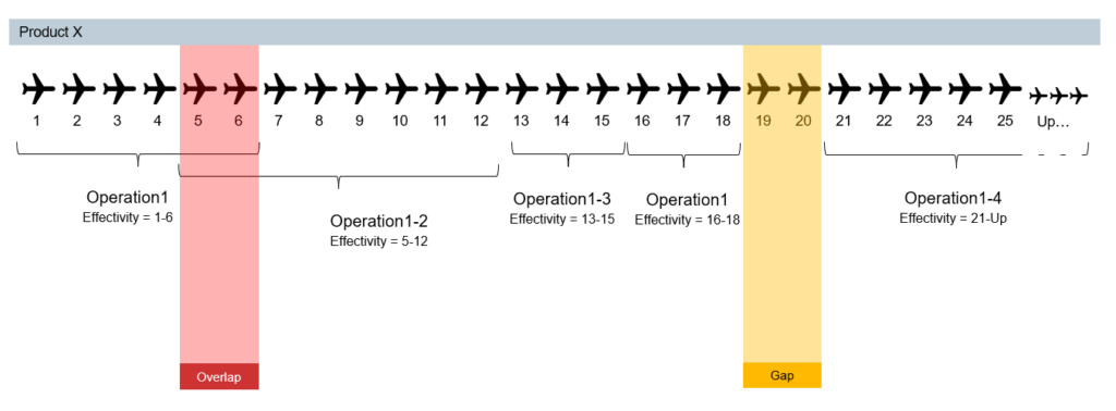
An example of a task-based UX design in Easy Plan, is the Validate Effectivity Coverage solution. This design was tailored to support the need of a manufacturing planner to ensure that a set of alternative occurrences, each with its own unit effectivity, covers a target unit effectivity range. For example, a set of alternative operations needs to cover the effectivity range of a given product (or End Item). There must not be any overlaps or unintended gaps in the effectivity coverage.

Active Workspace, the Teamcenter framework that Easy Plan is based on, enables showing the effectivity as a column on every occurrence. That’s often very useful, but – would it be good enough for validating effectivity coverage? Well, all the information needed to complete the task would be available, but a lot of mental and visual effort would be required from the users, and it would be easy to make mistakes. In the above example of the alternative operations, the users would have to find sets of operations that are alternative to each other, then, for each End Item, read the operations’ unit effectivity values, and verify that throughout the operation-set, these add up to the full expected range, with no gaps and no overlaps. Possible, but not a lot of fun.
In Easy Plan, the task of validating effectivity overage is very relevant, so it was important for us to provide good support for it. Based on discussions with customers, we analyzed the task and tailored a solution that utilizes information visualization: rather than displaying the unit effectivity values as numbers, we developed a graphical representation.
With this design, the target effectivity range is displayed graphically as a row of boxes, each box representing a unit. The effective ranges of each alternative operation are presented in a similar way, below it. The coverage state of each unit is evaluated and indicated by color on the target range (shown as “Summary”): gray – all-good (one effective operation), yellow – gap (no effective operation), or red – overlap (multiple effective operations).
The operation rows are interactive: the users can manipulate the effectivity of operations by clicking boxes or pulling handles. As they do so, the colors in the Summary row gets updated. When the task is done, all boxes in the Summary row should be dark gray. It’s very hard to miss an issue, and we have plans to improve it even further!
The coverage state of each unit is evaluated & indicated by color on the target effectivity range – shown as Summary
Following the positive reaction we got from customers, we are working to enhance this solution to support a similar use case of validating effectivity coverage between EBOM and MBOM.
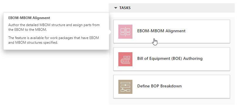
Validate Effectivity Coverage is just one example of task-based UX in Easy Plan. Focusing on tasks is the general approach in the system. Whether it’s a heavy, long, and complex task, such as EBOM-MBOM Alignment, or a light and short sub-task, such as Time Analysis for an operation, the users navigate their way through those focused and tailored solutions.

Manufacturing Planning with Teamcenter Easy Plan – User Experience Designed to Delight
When serving a very diverse user-audience as we do in Digital Manufacturing (and in Digital Industries Software in general), it can be a big challenge to identify and define clear workflows and methodologies that are applied consistently by all customers. The manufacturing industries are different from each other, and even when two companies are similar in the products they make, their internal workflows can differ. As a result, it is not always possible to design optimized solutions that will accurately suit all users. Nevertheless, with the goal of delivering great user experience, we keep striving to identify, define, and even recommend common workflows and best practices. For those, we aim to tailor perfect suites – solutions that are easy to use, efficient, safe, and delightful.
Learn More About Manufacturing Planning with Easy Plan
See how Teamcenter Easy Plan benefits BSH Home Appliances
Visit siemens.com/easyplan to learn more about task-based solutions for Manufacturing Process Planning.
Try Easy Plan today, with a free-30 day software trial.
See a demonstration of Manufacturing Process Planning with Easy Plan 6.0


